
On this page
What web design is
It covers the visual design, the structure of each page, the navigation between them, and how all of it adapts from a phone to a large screen. Good design makes the important things obvious: what you do, why someone should choose you, and what to do next.
It matters for search as well as for people. Search engines read the page the design produces: its headings, links and text. A design that puts the main message in an image, hides navigation behind scripts, or loads a heavy slider before anything else makes the site harder to rank and slower to use.
Mobile first
Google indexes the mobile version of your site, and for most businesses most visitors arrive on phones. Design for the small screen first: one column, readable text without zooming, buttons large enough to tap, and the main action reachable without hunting. Then widen the layout for tablets and desktops.
Two technical details make or break mobile layouts. Every page needs a viewport tag, which tells phones to fit the page to the screen. And that tag must not block zooming: setting maximum-scale to 1 or user-scalable to no stops visitors with weaker eyesight from enlarging text, and browsers and accessibility guidelines treat it as a failure.
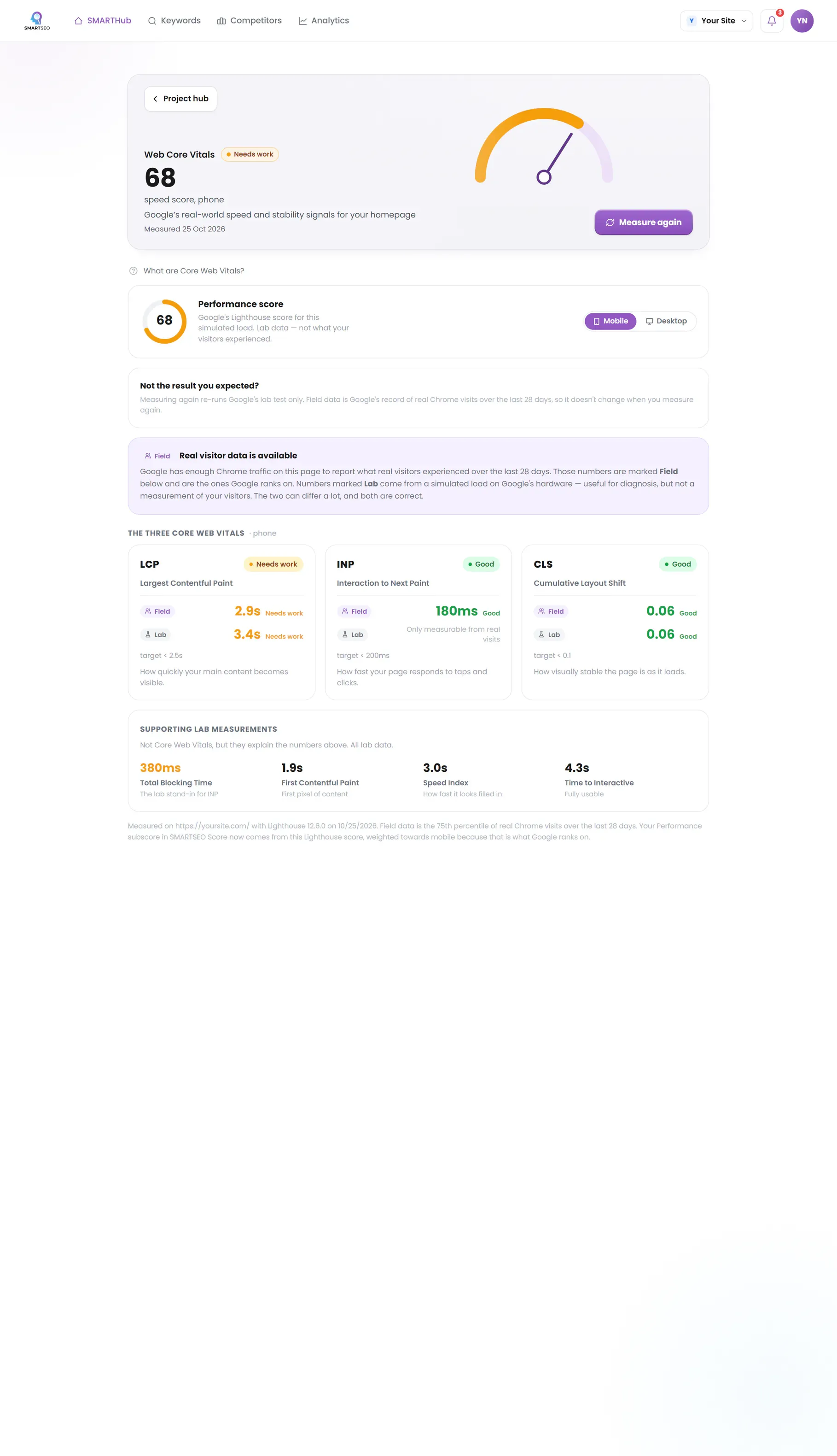
Example for illustration; not a client's data.
Layout and navigation
Each page should have one job and one main heading that says what it is. Put the most important content and action near the top. Keep navigation to the sections people actually look for, with labels in their words, and make every menu item a real link. A menu heading that only opens a submenu should still go somewhere useful, such as the section’s overview page.
Plan the structure as a few clear sections, each with a hub page that links to its detailed pages and back. That helps visitors orient themselves and helps search engines understand which page covers which topic.
Images and stability
Images are usually most of a page’s weight. Serve them in modern formats like WebP or AVIF, sized for the space they fill, and lazy-load those below the first screen. Always give images a width and height, or an aspect ratio in CSS, so the browser reserves their space and the layout doesn’t jump as they arrive.
Redesigns
A redesign is the riskiest moment for a site's search traffic.
How to check it yourself
- Try to zoom.
Open your site on a phone and try to zoom on any page. If you can't, the viewport tag blocks it.
- Tap each menu item.
Tap each item in the main menu; every one should go somewhere.
- Watch the text as images load.
Then reload a page on mobile data and watch whether the text moves as images appear.
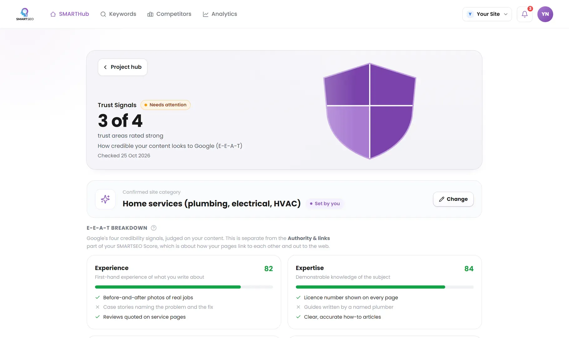
SMARTSEO checks every page it reads for a missing or zoom-blocking viewport, images without dimensions and links that go nowhere, measures your homepage’s speed and stability, and checks the trust details your kind of site should show.
The problems we find most often
Each of these is a check SMARTSEO runs on every scan, in the words the app uses. The last ones come from hands-on work, outside what the app checks. Open one to see what triggers it and how to fix it.
NoticeViewport stops people zooming
- What triggers it
- The viewport tag stops people pinching to zoom (user-scalable=no, or a maximum scale below 2).
- Why it matters
- The viewport tag stops visitors zooming in, which makes small text hard to read for many people.
- How to fix it
- Remove user-scalable=no, and any maximum-scale below 2, from the viewport tag.
NoticeImages without width and height
- What triggers it
- An image has no width and height, so the page can’t reserve its space.
- Why it matters
- Without a width and height the browser can't hold space for an image, so the page jumps as it loads (that jump is what CLS measures).
- How to fix it
- Give each image width and height attributes, or a size in CSS.
WarningLinks with no text
- What triggers it
- A link has no text, no label and no image description, so it says nothing about where it goes.
- Why it matters
- These links have no words, label or image description, so neither visitors using screen readers nor Google can tell where they go.
- How to fix it
- Add link text, an aria-label, or alt text on the linked image.
WarningMissing mobile viewport tag
- What triggers it
- A page has no mobile viewport meta tag.
- Why it matters
- Most searches happen on phones; without a viewport tag the page renders as a shrunken desktop layout, hurting the mobile Experience.
- How to fix it
- Add <meta name="viewport" content="width=device-width, initial-scale=1"> to the head of every page.
CommonA redesign that loses rankings
- What we see
- Traffic drops after launch because old addresses return 404 or content that ranked was cut.
- How to fix it
- List every page that earns traffic or links before you start, keep its address or redirect it to its closest new page, and keep the content that ranked.
Design choices that hurt, from our own old site
Our old WordPress theme looked fine on a laptop. SMARTSEO's read of it found the theme blocked zooming on phones, menu headings were links to nowhere, and most pages had images without a width and height.
SMARTSEO’s own project for its own site, read from stored data on October 28, 2026.
All three came from the theme, not the content, so every page had them. The rebuilt site fixes them once, in the layout.
Questions people ask
What makes a website design SEO-friendly?
Real text in the page rather than in images, one clear heading per page, navigation made of normal links, fast-loading images with dimensions, and a layout that works on phones. Design choices that hide content behind scripts or tabs make it harder for search engines and people alike.
How do I redesign without losing rankings?
Keep the addresses of pages that earn traffic or links, or redirect each one to its closest new equivalent. Keep the content that ranks, keep titles and headings close to what worked, and check Search Console daily for the first weeks after launch.
What is mobile-first design?
Designing for the phone screen first, then expanding for larger screens. Google indexes the mobile version of your site, and for most businesses most visitors are on phones.
Should I use a template or a custom design?
A good template is fine for many small businesses, if it's fast and you remove what you don't use. Custom design pays off when your brand, content or conversion path doesn't fit a template, or when the template's weight is what makes the site slow.
What we do for you
- Mobile-first page layouts for your content and customers
- Redesigns with a redirect plan that keeps your rankings
- Navigation and page structure built around what visitors look for
- Accessible design: contrast, labels, focus and zoom